Dýrfinna · Product design + React Native implementation
Helping owners act faster
when a pet goes missing.
Dýrfinna needed to replace an app affected by Android failures, disappearing pet records and broken communication features. As the sole product designer, I led the stakeholder workshop, defined the first-release scope and ran five moderated usability sessions on an interactive prototype. The findings directly shaped the final UI, which I am now implementing in React Native and Expo.
Project details
01 · Challenge & first-release focus
An urgent task was buried inside an unreliable product.
Dýrfinna supports owners, finders and a nationwide volunteer network, but the existing app tried to serve several needs without a clear priority. The team reported Android failures, saved pet records disappearing, scanner requests getting lost in email and an inactive group-chat feature. Lost-animal information was also difficult to scan, making an already stressful task harder.
During a workshop with the Dýrfinna team, we audited the existing experience, generated and prioritised ideas, and agreed that the first release should focus on the owner whose own pet is missing. They may be frightened, distracted and already outside searching, so the next action needs to be unmistakable.
The workshop created the initial product hypothesis: make reporting obvious, treat the last-known location as core information and make direct contact simple. I then turned those priorities into a focused first release rather than attempting to solve every communication need at once.
A focused first release
Workshop voting established the priorities, but release planning required another pass. I kept reporting, discovery, direct contact and status updates in scope, while deferring features that depended on heavier coordination or infrastructure.
02 · Usability testing
Five sessions showed what to preserve and what people could not find.
I built an interactive prototype covering the core reporting flow, lost-pet browsing and scanner contact, then ran five moderated usability sessions. Participants were approximately 40-62 years old, used both iPhone and Android, and included people with direct and indirect missing-pet experience. Facebook and neighbourhood groups were the main existing workarounds they described.
What the sessions showed
Reporting felt manageable
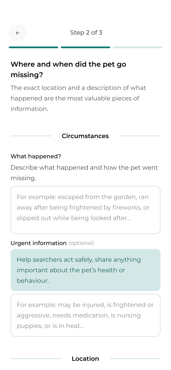
Participants found the three-step report clear and considered the questions necessary. The optional urgent-message field, however, was easy to overlook.
The map was valuable but hidden
Not everyone noticed the switch between list and map. Once participants found the map, they responded positively to it and considered it an important part of the experience.
Useful content sat below the fold
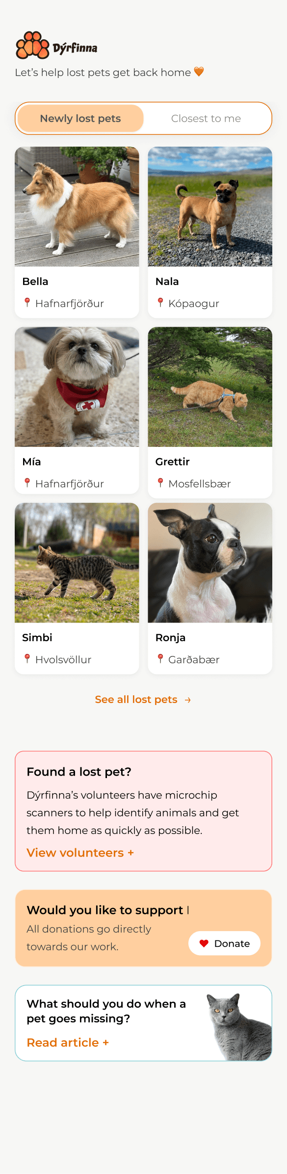
The Home screen felt too similar to Lost pets. The long animal list dominated the page and pushed guidance and support content out of view.
Assistance created the wrong expectation
The existing About screen made participants think they could choose and contact an individual Dýrfinna member directly. The small volunteer team and the product could not support that expectation.
Together, these findings gave me a clear direction: preserve the report structure, strengthen hierarchy and discoverability, and turn Assistance into a focused task rather than a promise of personal access.
03 · From evidence to final UI
The final UI focuses on the changes with the greatest effect on the core journey.
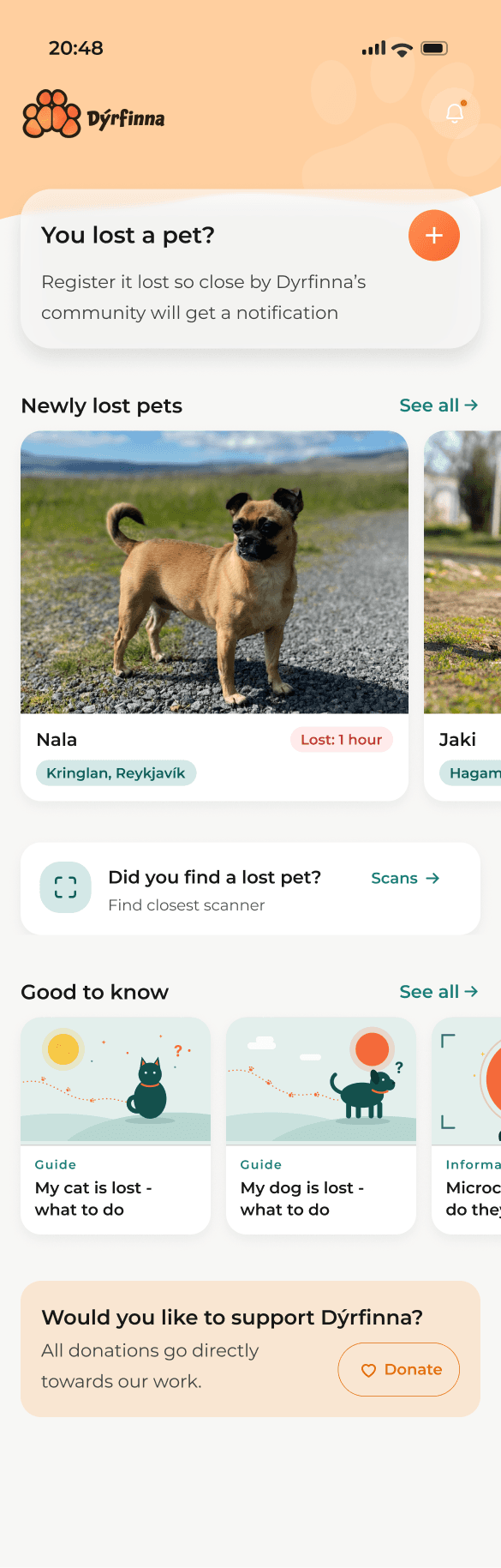
Make the most valuable action the starting point
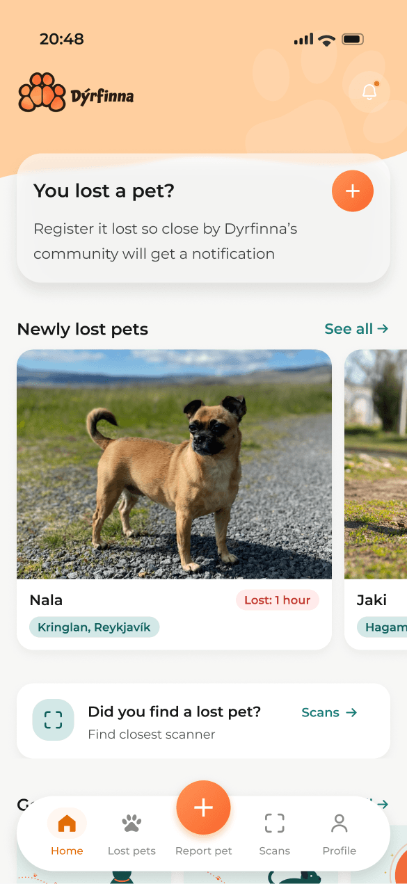
In the prototype, Home felt too similar to the Lost pets screen. A long list dominated the page while guidance, scanner information and other useful content appeared below the fold.
I moved “Report a lost pet” to the top and rebuilt the page into distinct sections with clearer purposes. Real photography is reserved for missing animals, while supporting content uses illustrations so it does not compete for attention.
Bring list and map into the main content area
The earlier list/map switch was easy to miss because it sat in the header alongside search and other controls.
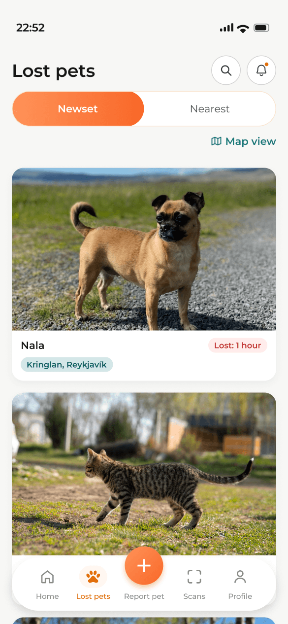
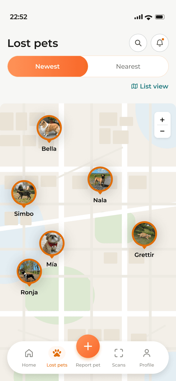
I moved search and filters into one focused modal, then placed the list/map control directly in the main content area beside the results. The list remains the default, but access to the map no longer depends on discovering a small header control.
Final UI
List
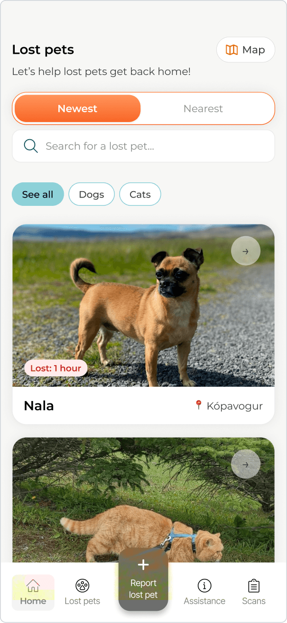
List
Map
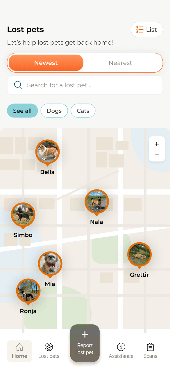
Map
Turn Assistance into a clear task
The old About screen centred Dýrfinna’s recognisable volunteer team and unintentionally suggested that users could select and contact an individual member.
I replaced it with a searchable, nationwide directory of volunteer microchip scanners. Dýrfinna members appear within the same directory rather than having separate personal profiles, and donation content moved to Home so this screen can begin with its main task.
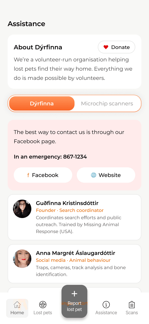
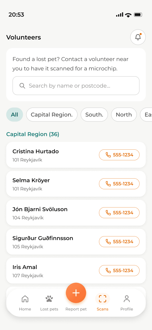
What testing showed not to change
Keep the report structure; strengthen one urgent moment.
Participants accepted the report’s length and three-step structure, so I kept it. Instead of redesigning the whole flow, I strengthened the urgent-message prompt by removing repeated information boxes from standard fields and reserving one clear supporting panel for information that needs attention.
04 · System & implementation
A small visual system connected the final UI and the working product.
Dýrfinna already had its logo and primary orange. I kept orange for actions that change data, introduced petrol for navigation, status and supporting information, and reserved red for urgent warnings and errors.
These rules gave buttons, filters, progress states, labels and navigation a shared logic across Figma and implementation. They also created a clearer foundation for design QA as the product moved into development.
From final UI to working product
I am implementing the final direction in React Native and Expo rather than treating development as a separate handoff.
Working in the real product surfaces states a prototype cannot fully answer: permissions, input validation, loading, errors, incomplete data and navigation behaviour. I treat those as product-design decisions and feed them back into the shared components as the build progresses.
05 · Outcome & next steps
Usability testing shaped a clearer final direction; the product is now in implementation.
The findings from five usability sessions supported the three-step reporting flow and the value of the map while exposing problems with hierarchy, discoverability and service expectations. The result is an evidence-informed first release and a working React Native implementation, with success to be assessed after launch through reliability, report completion, map and contact actions, and owners’ ability to update or close reports without assistance.
LESSON 01
Important actions cannot depend on discovery
Reporting, map access and scanner help need to be visible when they become relevant.
LESSON 02
Testing shows what to preserve
The report structure worked; the problem was the hierarchy around specific information.
LESSON 03
Scope protects the core experience
Deferring broader communication kept the first release focused on reporting, discovery and contact.